Improving Application Usability

— Rethinking information architecture for an intuitive navigation and seamless workflow.
Integration icon

Team

UX/UI Designer (me)
Product Owner
Business Analyst
Engineer
Integration icon

Role

User Research
Wireframe & Prototype
Information Architecture
Usability Test
Integration icon

Tools

Figma
Google Analytics
Jira
Aha!

Overview

The primary objective of this project is to enhance the Review Time Card screen within the Time & Attendance product suite, ensuring a seamless user experience and addressing the identified usability issues. The project also aims to rectify the navigation flaw, providing users with more intuitive access to the  Time Card Management application.

The Problem

Time & Attendance is a key product in Unifocus' portfolio. Through our analysis of usage data, we have identified significant areas for improvement in the Review Time Card screen. Furthermore, we have observed a navigation flaw that impedes users from accessing this application efficiently, which is particularly counterintuitive considering its status as the most widely used feature.

Who does this problem affect?

Department manager
Manage hundreds of employees's timecard. Review and ensure the data is correct daily.

Payroll administrator
Manage payroll and benefits. Ensure compliance.

UX Audit

The primary user feedback highlights the absence of an intuitive search tool to locate employees' names within the Timecard Management application. This limitation proves counterproductive, considering the users' daily task of managing hundreds of employee timecards. Additionally, users expressed frustration when working with a crowded table of data that lacks essential information.

In light of this feedback, I have made the decision to conduct a comprehensive UX audit of the Timecard Management application. The audit will focus on evaluating the usability and conducting a content evaluation to address these concerns and enhance the overall user experience.

Proposals

After conducting the UX audit and gathering feedback from user interviews, I have developed a set of suggested solutions aimed at enhancing the visual appearance of the Review Time Card. These proposals have been communicated to our Product Manager (PM), Business Analyst (BA), and engineering team to assess the required level of effort and potential benefits.

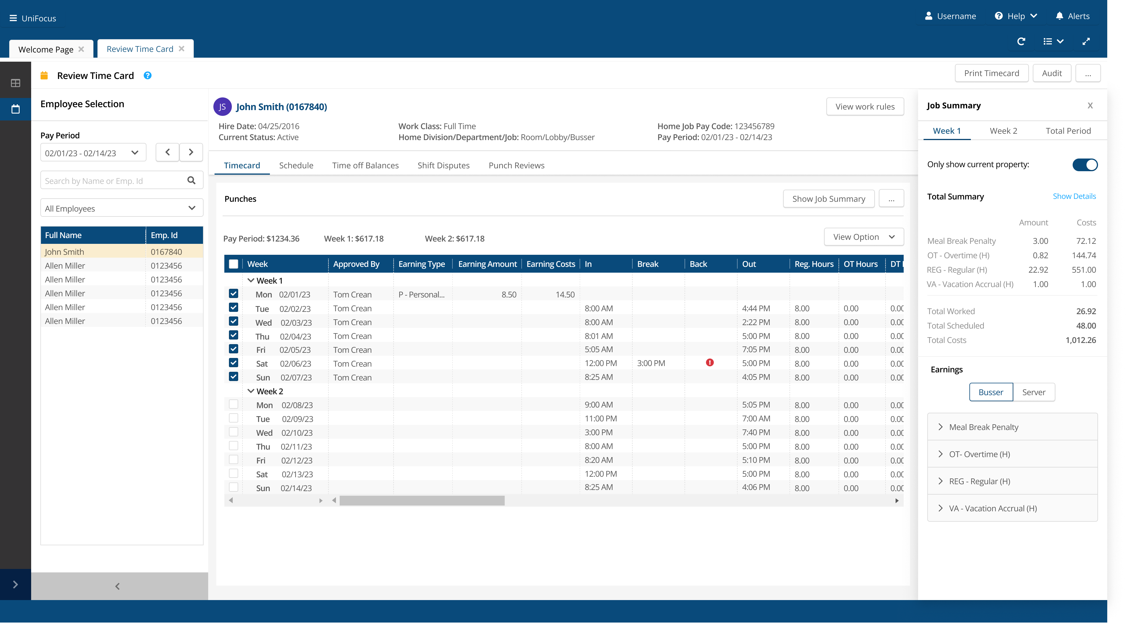
Implement a new search tool for users to search by employee's name or ID, ability to enter pay range and additional filtering options.

New Search Tool

Content evaluation to display only decision-making information. Move out of AG grid and provide an intuitive navigation.

Redesign timecard table

Adding employee's information such as department, job code, pay code for manager to refer to when reviewing employee's time card.

Employee's header

Consolidate the additional details section into tabs. This approach works well to enhance in-app navigation and reduce clutter.

Tabs Approach

Solution Ideation

Given the data from user feedback and tracking analytics, I designed the new timecard with a tab approach in mind. This provides an easy way to switch back and forth to multiple data section when managers performing their tasks. I also broke down the pay range in weeks for a quick snap shot of punches and earnings for each week.

I also added a header that contains employee information. This addresses one of our users' pain points since they have to navigate to different application to get the information.

Since the timecard screen contains a lot of data, I wanted to display it as clean as possible but still provides useful data for managers to make decisions.
New timecard table sketch
Hi-Fidelity Mockup

Usability Test

The team did not want to wait until final design for user feedback. We think it would be beneficial to have user feedback on our design at the early stage to ensure our approach meets their needs and solve their problems.

We conducted a round of testing with 5 managers from different hotel properties who are currently using this version of our T&A product suite.

"It looks cleaner. I love that we incorporate a search tool, this will speed up my process when reviewing multiple employees' timecard. The data displayed on the table is what I care the most."

Sam F.

"Everything looks great. It is super helpful to have all the employee's information on the top. Job summary is a big section and I want to view it together with the punches table."

Helen W.

Iterations & Final Design

Based on the affinity map, I created a priority matrix to determine which improvements I could tackle first for intuitive navigation. I wanted to ensure the new app flow and content hierarchy do not cause any confusion.
New seach tool solve navigation flaw
Cleaner timecard table with useful data
iPhone mockup
Side drawer contains additional information
Header section with employee's detail

Conclusion

In conclusion, this project successfully redesigned the Review Time Card screen within the Time & Attendance system, resulting in a significantly enhanced user experience. By addressing the identified usability issues, we have improved the overall efficiency and usability of the application. Additionally, the navigation flaw has been rectified, providing users with more intuitive access to the Review Time Card application.

Key metrics that we used to measure success:

User Satisfaction: Conduct post-redesign surveys or interviews to measure user satisfaction with the new Review Time Card screen.

Task Completion Rate: Monitor the rate at which users successfully complete tasks related to reviewing time cards. A higher task completion rate would indicate that the redesign has simplified the process and reduced user errors.

Time Saved: Measure the average time saved by managers when reviewing time cards after the redesign. This metric will demonstrate the efficiency gains achieved through the improved user experience.

Error Rate: Track the frequency of errors encountered by users while reviewing time cards. A lower error rate would indicate that the redesign has effectively addressed the identified usability issues, resulting in fewer mistakes during the process.
Back to Unifocus Page
Continue reading...

Other projects

Moner main image

Moner

Optimizing finance management
Link to project

La Madeleine

Streamlining highly-customizable order flow
Link to project

Pro Brite

Conversion-focused website